Major rebrand and website launch new era for PR and communications firm
An award-winning PR and communications agency is ready to embark on an exciting new chapter in its history following a major rebrand.
MIH – which stands for ‘Make It Happen’ – has spent months carefully designing and building an eye-catching, user-friendly new website that showcases the huge range of services it offers.
And those services will now be delivered under the Burton-based company’s new MIH Group brand, the centrepiece of which is a fresh and modern new logo.
Bosses say the rebrand, which coincides with a move to new modern offices at the heart of Burton-on-Trent, positions MIH as a major player in the field of communications and PR.
It brings all its services under a single MIH Group umbrella, including MIH Spaces – the company’s new arm offering conference and workshop facilities hire.
MIH associate director James Benstead, who has spearheaded the rebranding and new website project, said: “At MIH, we enjoy a fantastic working environment that gives us space to be creative and explore new ideas. Our tight-knit team of communications and production experts love working together every day.
“That’s never been more evident than in the last few months as we’ve collaborated to build a brand befitting the dynamic, flexible and ambitious company that MIH is today.
“We hope those visiting the new website will love its stunning visuals and new video library, as well as its intuitive navigation features and thought leadership content.
“We’ve optimised the site’s functionality to give users easy access to the information they need, without having to wade through anything they don’t.
“Our aim has been to take the MIH brand to a new and exciting place – the bedrock our business needs to realise its ambitions.”
Key to the new website design is improved functionality that allows visitors to instantly zone in on the services they are interested in – whether that’s strategic communications and PR; video and photography; crisis and media handling; or training and development.
MIH’s key specialism, providing consultancy services for healthcare organisations, can also be explored in a new and dedicated section of the site.
Extensive case studies and testimonials showcase MIH’s previous work, while a new range of educational blogs and insightful content is waiting to be discovered.
The MIH Spaces page showcases MIH’s clean, modern conference room, which includes a long table and chairs and a large widescreen monitor ideal for presentations.
The page also explores the adjoining breakout room, kitchen and washroom that are available as part of affordable hire packages.
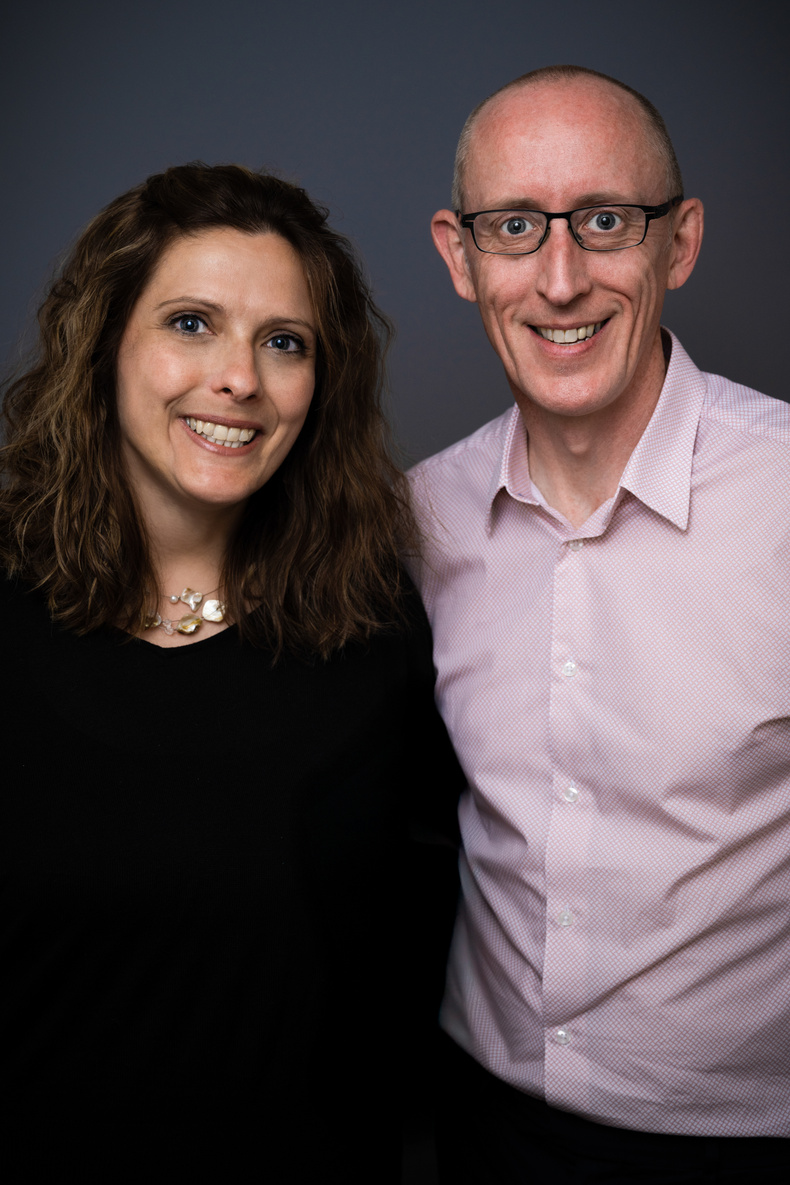
MIH managing director Jo Yeaman said: “A great deal of thought has gone into our new branding and every colour, shape and font is designed to reflect our evolution as a business.
“Our logo, for example, is built within circles, which are universally recognised as symbols of unity and wholeness. They symbolise the togetherness of our team in the pursuit of excellence, as well as our position as a trusted partner to our clients.
“The point at which the circles overlap represents the crossover of our strategic PR and communications services, with a sweet spot of success at the centre. The overlap is also a nod to the diverse knowledge and skillsets that each member of the MIH team brings to the table.
“The dominant aubergine colour denotes bravery and creativity, while the ‘swoosh’ running through the lettering is a visualisation of the dynamism in our work and the upward trajectory of the company.”
Pictured from left to right: Jo Yeaman and Jon Beech